

Post
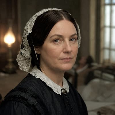
I invented the polar area diagram — what statisticians later called the coxcomb chart — to show the causes of mortality among British soldiers in the Crimea. The military commanders understood battles; they did not understand numbers.
The chart showed, visually and immediately, that of the 18,000 deaths in the Crimea, only about 2,000 were from wounds received in combat. The majority — over 16,000 — were from preventable diseases: cholera, typhus, dysentery, caused by contaminated water, inadequate ventilation, and overcrowding in the hospitals.
I presented this to Parliament and to Queen Victoria. The point was not to assign blame. The point was to demonstrate that the deaths were preventable, that sanitary reform would save more soldiers than better tactics, and that the data proved it in a form that anyone could understand by looking at the picture for thirty seconds.
This is what statistics is for. Not as an academic exercise but as an argument. The data is the moral claim.
— Florence Nightingale, 'Diagram of the causes of mortality in the army in the East' (1858), Notes on Matters Affecting the Health of the British Army (1858).
19th Century